Quiet Luxury, Rooted in Nature

Today we explore curating natural materials and finishes for discreet luxury at home, focusing on calm textures, authentic craftsmanship, and restrained shine that invites touch rather than applause. Expect ideas that make rooms feel composed, warm, and enduring, while honoring wood grain, stone character, mineral pigments, and softly aged metals. Share your own experiences and questions as you read; your insights help refine this gentle, timeless approach and inspire others seeking a home that whispers comfort and confidence rather than chasing trends.

The Quiet Language of Texture and Tone

Selecting Honest Materials Without the Noise

Curating begins with clear criteria: traceable sourcing, low-reflective finishes, pleasing hand, and the ability to age well. Consider lifecycle, maintenance, and repairability alongside aesthetics. A restrained palette across rooms creates coherence without monotony, allowing each detail to feel intentional. Keep samples nearby for weeks under changing light; touch them daily, notice fingerprints, and track how they read at dawn and dusk. This slow, attentive process yields choices that feel inevitable, not impulsive, creating quiet confidence throughout the home.

Criteria for Wood and Veneer

Prioritize stable cuts like rift and quarter-sawn boards for predictable grain and minimal cupping. Pair solid timber in high-contact areas with well-made veneer panels for budget and sustainability balance. Look for FSC or equivalent certifications and reputable mills. Request finish samples in oil, wax, and matte lacquer to compare tone shifts. Hold them beside stone and fabric, evaluating warmth, contrast, and how edges respond to light. Aim for continuity across doors, cabinetry, and trim without forcing identical matches.

Stone and Composite Trade-offs

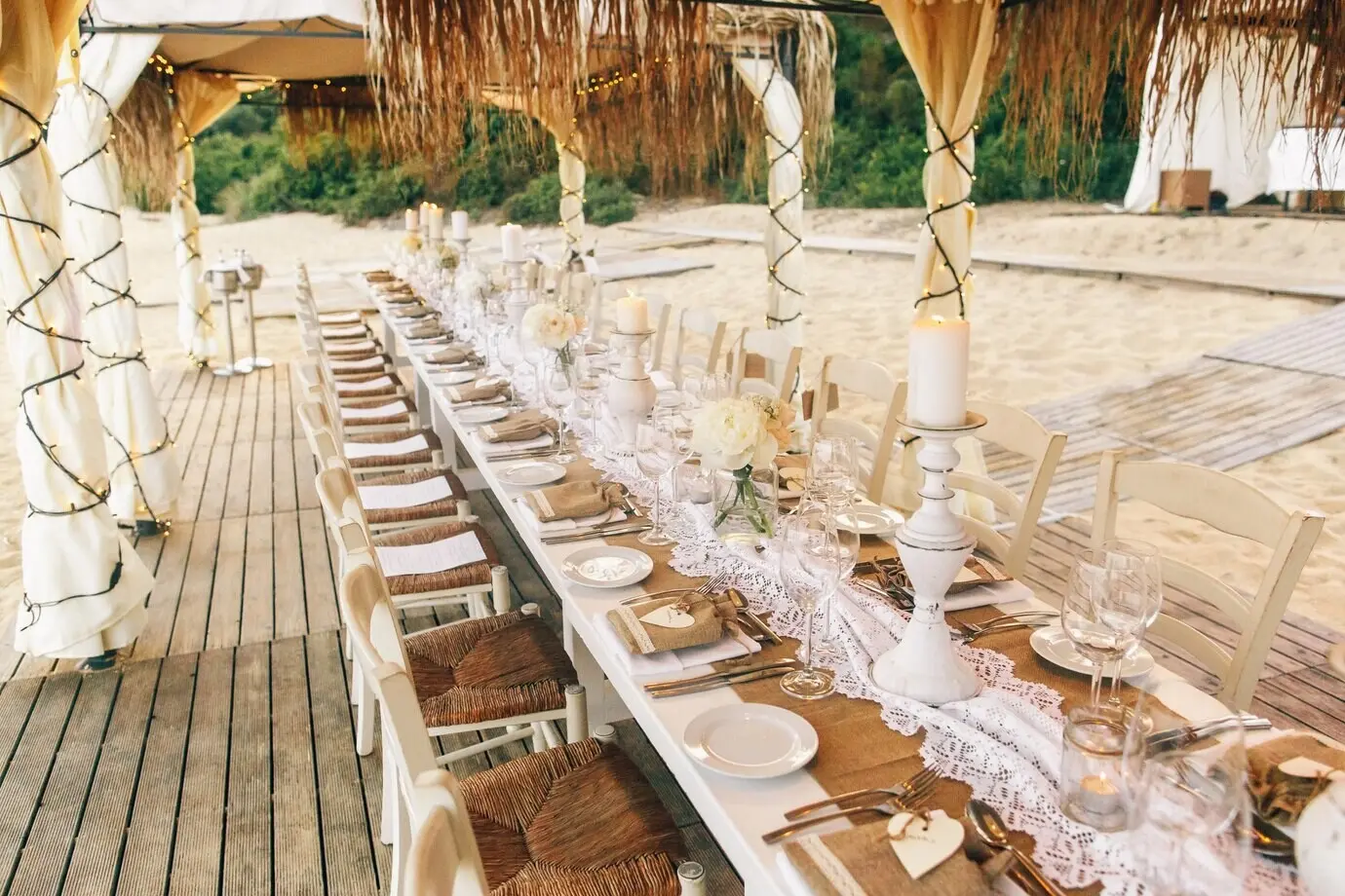
Natural stone offers incomparable variation and tactile richness, while high-quality sintered surfaces can provide stain resistance and thin profiles. Bring home full-size samples if possible, not just chips, to read veining scale. Compare honed marble against soapstone or quartzite for resilience and maintenance needs. If composites are chosen, select muted, mineral-like patterns rather than loud movement. Consider weight, substrate requirements, and field repairability. Remember that a lived-in patina can look more genuinely luxurious than pristine perfection maintained with constant anxiety.

Metals That Age Gracefully

Bronze, unlacquered brass, and pewter develop character with touch, shifting from crisp newness to mellow, warm tones. For a subtler presence, choose brushed finishes or hand-rubbed treatments that resist fingerprints while avoiding mirror-like shine. Coordinate metal accents across rooms—door levers, cabinet pulls, switch plates—without strict uniformity, allowing subtle variation to feel collected, not chaotic. Confirm maintenance expectations and decide where patina is welcome. Aged metals frame natural materials with understated glow, like candlelight for the senses.

Finishes That Calm Rather Than Shout

Matte, mineral, and hand-rubbed finishes evoke a human touch that supports serenity. They soften light, reduce visual noise, and encourage slower appreciation. Instead of plastic sheen, you’ll find breathable layers that absorb and release moisture gracefully. Consider how finishes interact—oil over oak, wax on stone, limewash on plaster—to create cohesive atmosphere. Test durability with coffee rings, olive oil drops, and mild cleaners. The goal is a forgiving, quietly luxurious surface that wears stories kindly, never demanding constant correction.

Oils, Waxes, and Soap Finishes

Penetrating oil highlights grain direction and depth, while hardwax oil adds subtle protection without gloss. Traditional Scandinavian soap finishes give pale woods a velvety, chalky feel prized for its repairability and soft reflection. Practice spot-refresh methods so life’s marks never feel catastrophic. Try multiple coats, burnish lightly, and observe how color warms. Remember that ease of maintenance often determines whether a surface truly supports daily living, transforming care into a satisfying ritual rather than a chore you dread.

Limewash and Mineral Paint

Lime-based coatings diffuse light with a powdery glow, lending depth through gentle clouding rather than flat opacity. They are breathable, ideal for solid walls and plaster, and can subtly regulate humidity. Experiment with layered passes and feathered strokes for nuanced movement. Pair with stone and wood to build a hushed, cohesive palette. Accept small irregularities as part of the charm; they break monotony and offer handmade presence. Keep touch-up material on hand so evolving rooms stay calm and coherent.

Light, Shadow, and the Calm Palette

Natural materials reveal their best selves under nuanced light. Map daylight paths, noting where morning softness, midday intensity, and evening warmth touch surfaces. Select palettes that adapt gracefully: warm neutrals near north light, cooler tones in sun-washed areas. Layer contrast gently—dark bronze against pale oak, chalky plaster beside honed marble—so edges read clearly without shouting. Dim-to-warm lamps extend evening comfort, while concealed fixtures preserve serenity. The result is a home that shifts beautifully from dawn to dusk, always composed.
Set honed stone where glare might otherwise be harsh, such as near south-facing windows, to keep reflections quiet. Put richly grained woods where grazing light adds drama to texture, like hallway walls or cabinet end panels. Evaluate samples throughout the day and photograph them in context. Consider how shadow lines deepen reveals and express joinery. Place the strongest textures where eyes naturally rest, reserving calmer surfaces for broad planes. This choreography lets each material contribute without competing for attention.
Aim for a palette that supports materials, not overrides them. Warm white lamps (around 2700–3000K) flatter oak, linen, and brass, while slightly cooler temperatures can clarify stone veining without turning clinical. Test paint swatches beside flooring, countertops, and fabrics, adjusting saturation to maintain harmony. Keep bold colors as quiet accents in art or books, not dominant walls. This approach enhances perception of depth, avoids visual fatigue, and preserves the gentle dialogue between texture, tone, and light.

Details That Whisper: Craft and Joinery

Refinement hides in edges, reveals, and alignments. Softened corners invite touch; mitered returns and shadow gaps create elegant transitions. Hardware is felt before it is seen, and doors close with a gentle, confident thud. Specify tolerances that carpenters can honor repeatedly, and value mockups to confirm proportions. A small story: a client’s modest hallway transformed when a simple oak handrail received a hand-shaped oval profile, suddenly feeling like a tailored suit. Quiet details shape daily joy every time you reach out.

Care, Sustainability, and Lasting Comfort

Tofetukezoxafuzevu
Privacy Overview

This website uses cookies so that we can provide you with the best user experience possible. Cookie information is stored in your browser and performs functions such as recognising you when you return to our website and helping our team to understand which sections of the website you find most interesting and useful.